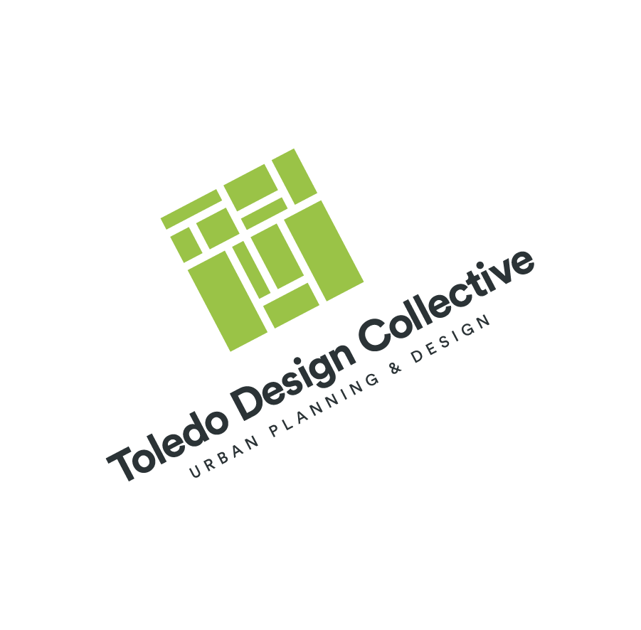
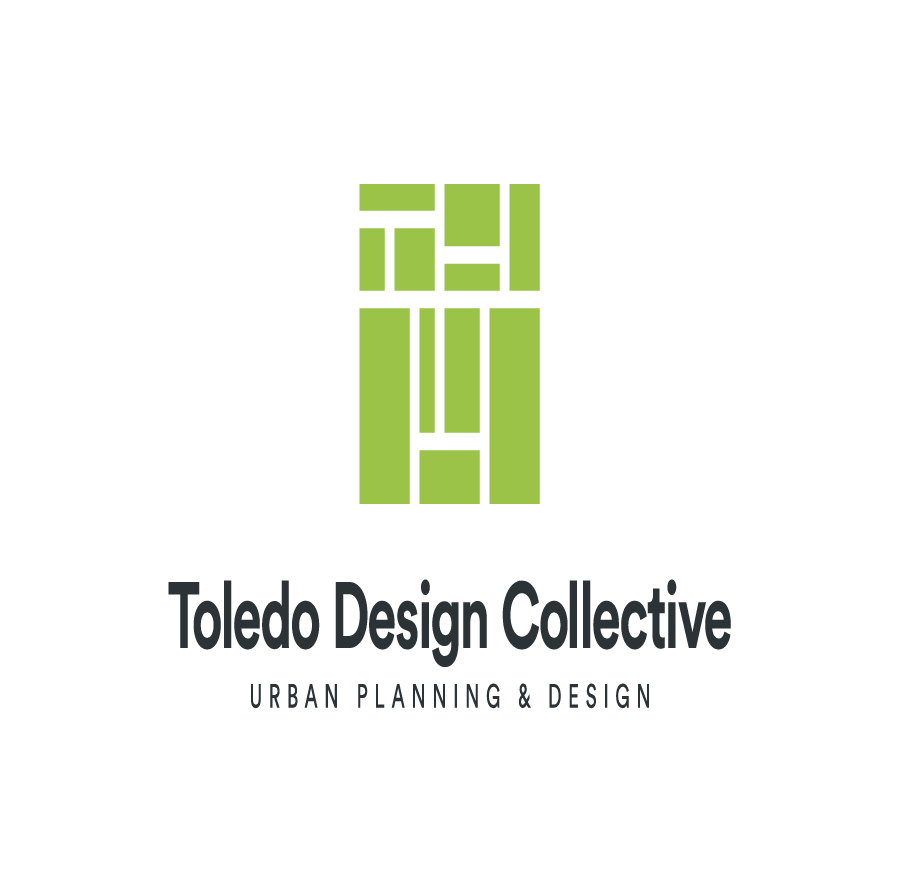
Primary Logo
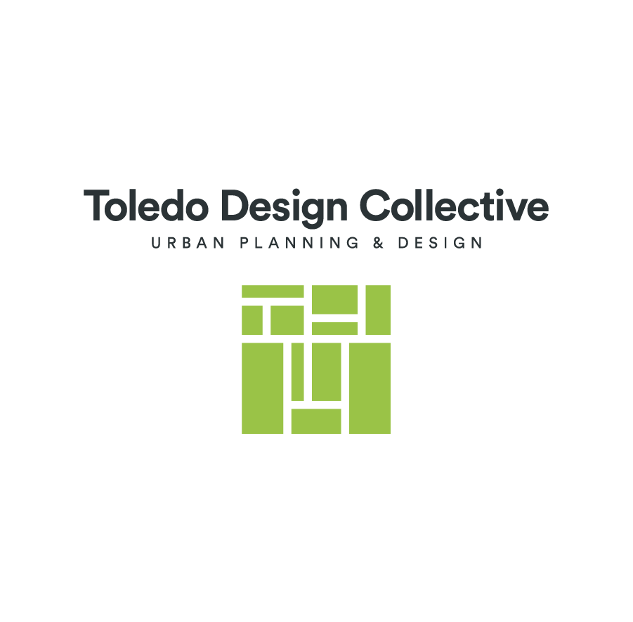
The primary TDC logo, and preferred logo whenever possible, is the center-stacked version in the primary color combinations pictured below.
The primary TDC logo, and preferred logo whenever possible, is the center-stacked version in the primary color combinations pictured below.
There are also secondary color versions of the center-stacked logo pictured below. These combinations are acceptable for use when the primary colors are already the majority of the application.
In addition to the center-stacked logo, there is also a horizontal version of the logo in both primary and secondary color combinations. The horizontal logo allows for flexibility in applications where a horizontal dimension or left-aligned treatment is more appropriate.
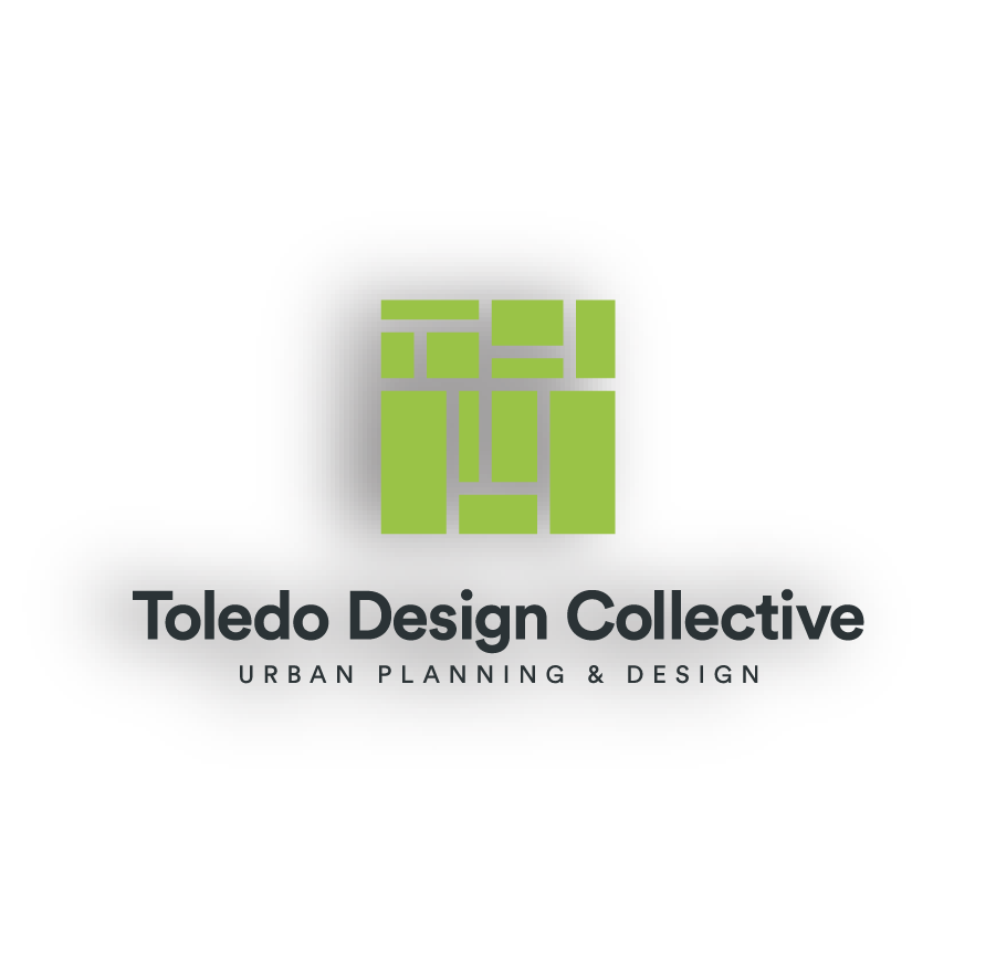
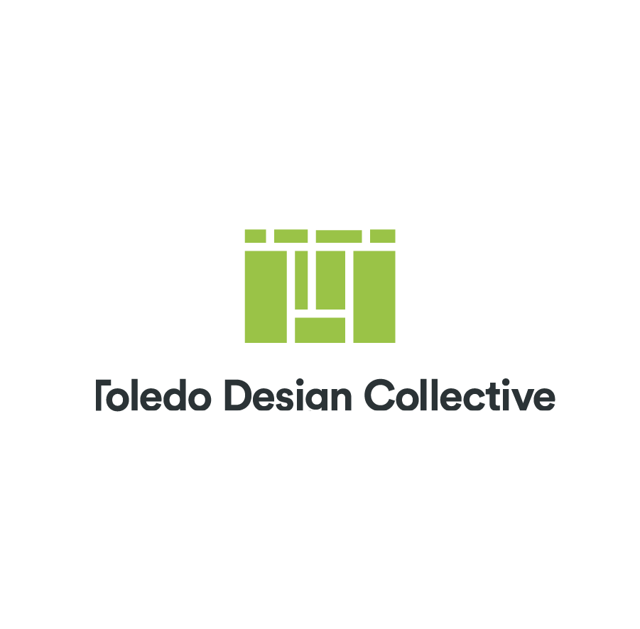
It is very important the logo has proper clear space surrounding it – it should not be too close to any other graphic elements or the edge of a page. Be sure to refer to the diagram below when placing the logo into artwork.
The primary logo should never be used at less than 2″ wide in size for any application, and the horizontal logo should never be used at less than .75″ tall.

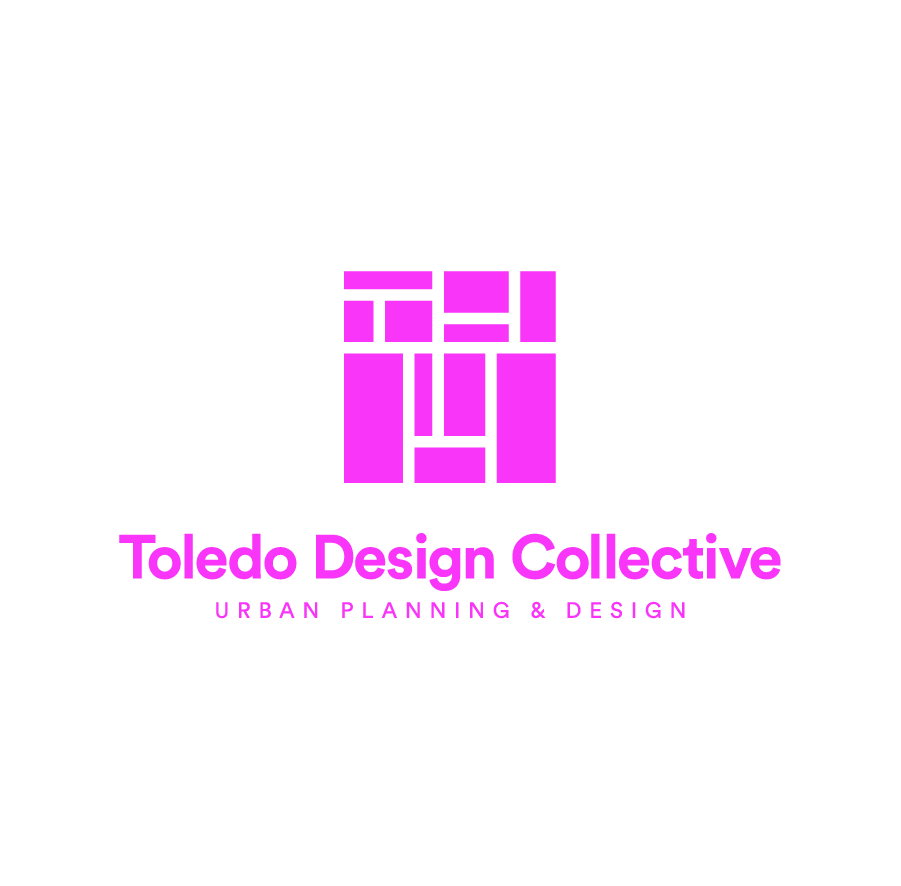
The following images show examples of logo violations – be sure to refrain from using the logo any of these ways.
The TDC color palette is inspired by nature and consists of three separate palettes: primary, secondary, and tertiary. Each palette, and its usage, is outlined below.
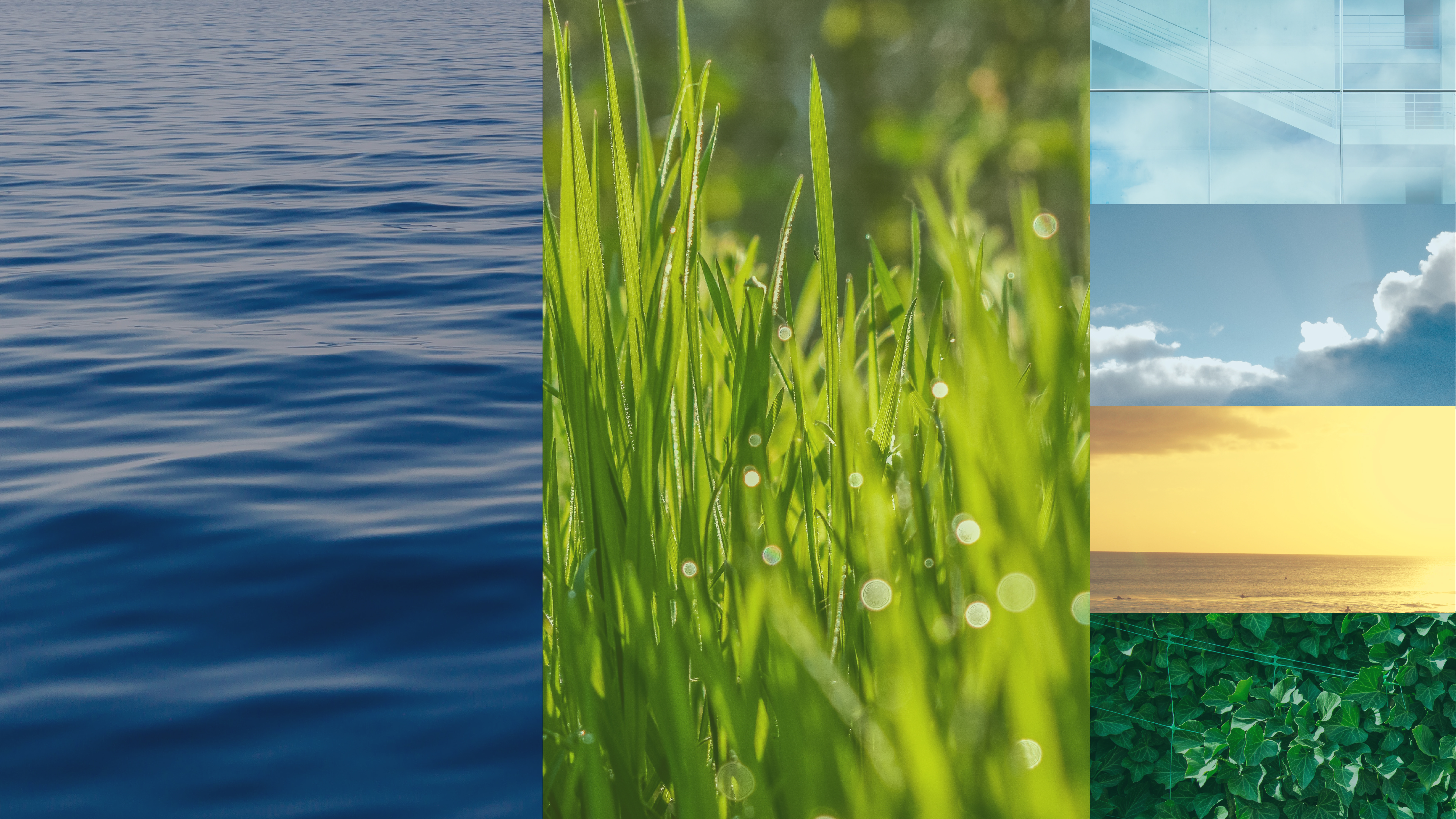
The primary palette is made up of Lime and Navy. These colors should always be present in TDC materials and make up the majority of the color usage.
The secondary palette, consisting of Forest, Carolina, Seafoam, and Sunlight are to be used to support the primary palette. These colors should never take up a larger percentage of an application than a primary color but can be used liberally as accent colors.
The tertiary palette use is to be limited. These colors – Deep Gray, Orchid, Maroon, and Sunset – are to be used only for complex applications where additional colors are needed. An example of an appropriate tertiary palette use is in a proposal map that has many elements to be labeled.
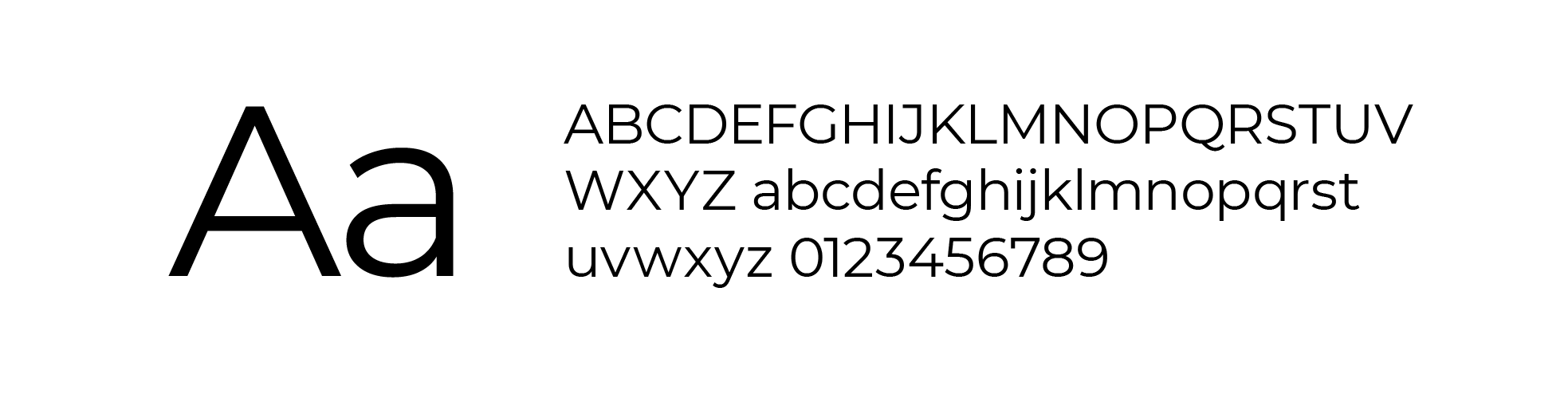
The TDC brand uses two typefaces outlined below.
Montserrat is the primary font for the TDC brand. It is available to download at the link below.
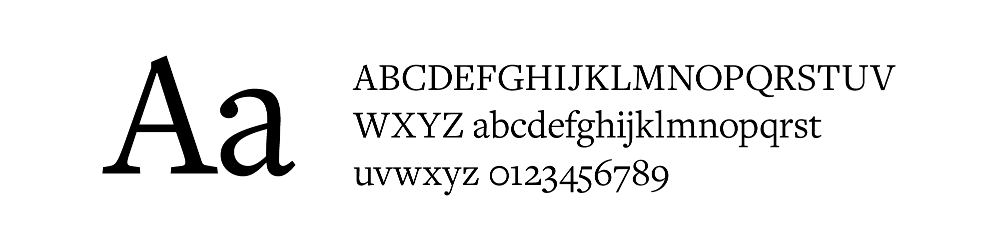
Freight Text is the secondary font for the TDC brand and is used in headlines and large text. It is available for purchase at the link below.
The below images show examples of how the TDC brand can be applied.